Shirt Design for T-Shirts: What Makes a Design Actually Work on Fabric
A lot of custom t-shirt designs look fine in the mockup and disappointing in person. Understanding why — and how to avoid it — is what this guide covers.
Why t-shirt design is different from other design
Designing for a screen is fundamentally different from designing for a shirt. On a screen, you control contrast, brightness, zoom level, and viewing distance. On a shirt, you control none of these. Your design needs to:
- Read clearly from across a room (8–15 feet)
- Look good when the fabric is moving and wrinkling
- Work with whatever other clothing the person is wearing
- Survive 100+ wash cycles without fading or cracking
- Look intentional, not accidental
These constraints push toward simplicity, high contrast, and strong silhouettes — the fundamental principles of effective t-shirt design.
The five fundamentals of effective shirt design
1. Composition: one clear focal point
Every great t-shirt design has one thing the eye goes to first. Not three things competing for attention — one. Your subject, centered and dominant. Everything else in the design should support the focal point, not compete with it.
The classic compositional approach: subject centered on the chest, roughly between the collar and the midpoint of the shirt. Enough margin on all sides that the design breathes. Nothing reaching to the edges of the print area.
2. Contrast: make it pop against the shirt
The shirt color is the background of your design. The design needs to contrast clearly against it. Dark design on light shirt, light design on dark shirt. Medium-value designs on medium-value shirts look washed out in person.
The highest contrast options: black design on white shirt, white design on black shirt. From there, any strong contrast combination works — bold color on white, white on rich dark color.
3. Color: limit the palette
Two to four colors. This isn't arbitrary — it's based on how shirts are printed and how designs read. DTG printing handles full color, but designs with more colors often look busier and less intentional than those with a tight palette. Screen printing literally charges per color.
A strong limited palette creates visual cohesion. Look at enduring shirt brands — most of their designs use 2–3 colors, maximum. Black and white alone is one of the strongest approaches.
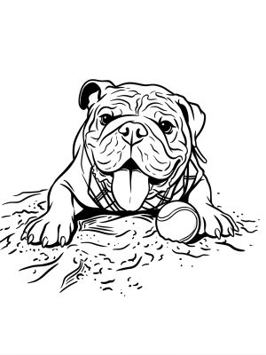
4. Silhouette: the test that matters most
Squint at your design until the detail disappears. What's left is the silhouette. If you can still tell what the design depicts from the silhouette alone, you have a strong design. If the silhouette is a blob, the design will look unclear at viewing distance.
Animals, faces, objects with distinctive shapes — these make strong silhouettes. Abstract compositions and text-heavy designs often fail this test.
5. Detail level: print what you can see
Fine details — thin lines under 1pt, tiny text under 12pt, subtle gradients — get lost in printing. The technical floor for printed detail is higher than you'd think. Design at the final print size (typically 10–14 inches wide for a full front) and evaluate at that size, not zoomed in.
Print placement: where to put your design
Full front chest (most common)
Centered on the front, typically 3–4 inches below the collar. The standard placement. Works for any size design from small to large.
Left chest (pocket area)
Small design (3–4 inch square) over the left breast pocket area. Looks intentional and understated — good for logo-style designs.
Full back
Large design centered on the back. Often combined with a small front design. Good for text-heavy designs (event names, rosters) where readability at a distance matters.
Sleeve print
Small design on the sleeve. Unusual and distinctive — works well for a secondary design element alongside a main chest print.
Common shirt design mistakes and how to fix them
Mistake
Too much text
Fix
Reduce to one line. Text as the primary design element works only if it's short, bold, and readable at 10 feet.
Mistake
Design too small
Fix
Most people err too small. A chest design should fill at least a 8×8 inch area to be clearly visible. The print area can go up to 12×14 inches.
Mistake
Design placed too high
Fix
The top edge of your design should sit 3–4 inches below the collar seam. Designs placed higher look awkward and get hidden under collars.
Mistake
Photo printed directly
Fix
Photos rarely print well — too much photographic detail, wrong contrast for DTG, background competes with subject. Convert photos to illustration style first.
Mistake
Clashing shirt and design colors
Fix
Choose shirt color as part of the design process. Preview the design on the actual shirt color you're ordering, not just on white.
How AI applies these principles automatically
One of the practical benefits of using AI tools like MadeFromArt for shirt design is that the AI is trained specifically for print-ready output. This means the design principles above are baked into how the models generate results:
- White or transparent backgrounds — no competing background in the print area
- High contrast between subject and background
- Bold outlines and clear edges that survive printing
- Art styles (line art, pop art, flat illustration) that translate directly to fabric
- Simplified subject without detail too fine to print
You still need to make the right choices — subject, style, shirt color, placement — but the design execution follows print-safe principles by default.
Apply these principles with AI-powered design
MadeFromArt generates shirt designs that follow these fundamentals — bold, high-contrast, printable artwork from your photos. Two free designs to start, no account required.
Try It Free